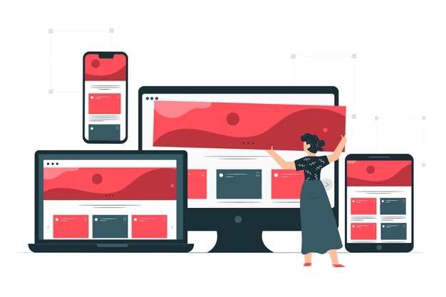
Ultimate Advantages of Mobile-Friendly Website
As technology is continuously changing, the way of using the internet is also changing. Over the past few years, laptops and computers are somehow replaced by mobile phones. Mobile phones are more convenient than laptops and computers. People prefer mobile phones to browse the internet.
Earlier, websites are designed in this way that optimizes for computers and laptops. But now, it is important to design the website in this way that it will optimize for mobile phones. Mobile-websites started as a new chapter in the field of digital marketing. This new concept is a tremendous way to grow their business. Digital marketers knew the importance of mobile-friendly websites as people did not have too much time to open their laptops or computers for every search. That’s why mobile-friendly websites are an effective way to reach out to the maximum people.
Many studies concluded that 25% to 60% of internet traffic came from mobile phones. This percentage may vary from industry to industry. As the websites were designed for laptops, the websites did not optimize on mobile phones. However, many search engines provide the option of a desktop site, but still, there is a need for a website that optimizes for mobile phones to give a smooth experience to their users.
Advantages of the mobile-friendly website: -
- Better and smooth experience: - As the websites which are not mobile-friendly websites are not open properly on mobile, and that led many users to abandon the website. The mobile-friendly website gives a better experience to the user. A mobile-friendly website is a convenient way to connect with a large audience, as most users have mobile-phones, but very few users have laptops or computers.
- Budget-friendly and effective: - The mobile-friendly websites are cheaper than app development. Many studies show that an app can hang in some cases, but there are very few chances that a website can hang.
- Faster experience: - A mobile-friendly website loads website or web page faster than a simple website. This advantage gives the ultimate experience to every user while streaming the website.
- More reach: - As earlier, we understood the value of mobile-websites. It has more reach to connect the maximum number of people. Every business wants to connect with every user who is searching for the same product. As the competition is very high, but these small things can improve your digital marketing.
- It aids SEO: - As mobile-friendly websites enhance the experience of a user and increase average time on the site. This results in the overall growth of the website. Hence the mobile-friendly website trends on the top of the Google search page.
How to design a beautiful website that optimizes perfectly? Here is the top mobile-friendly Website Designing company: -
Trimwebsolutions - Website Designing company in delhi ncr
723 0 7
Write a Comments
* Be the first to Make Comment


Recent Posts

Starting Your Own Freelan...

Start Your Website Design...

Starting Your Own School...

Starting Your Shopping Bu...

Starting Your Own Securit...

Starting Your Event Plann...

Steps to Start Your Fitne...

Game Plan: 20 Important S...

Steps to Start Your Cater...

Steps to Start Your Own C...
Contact Details
(+91) 81306 40 966
(+91) 78277 51662
live:trimwebsolutions
New Delhi, India